Abstract Logo

Da Villa Pizza

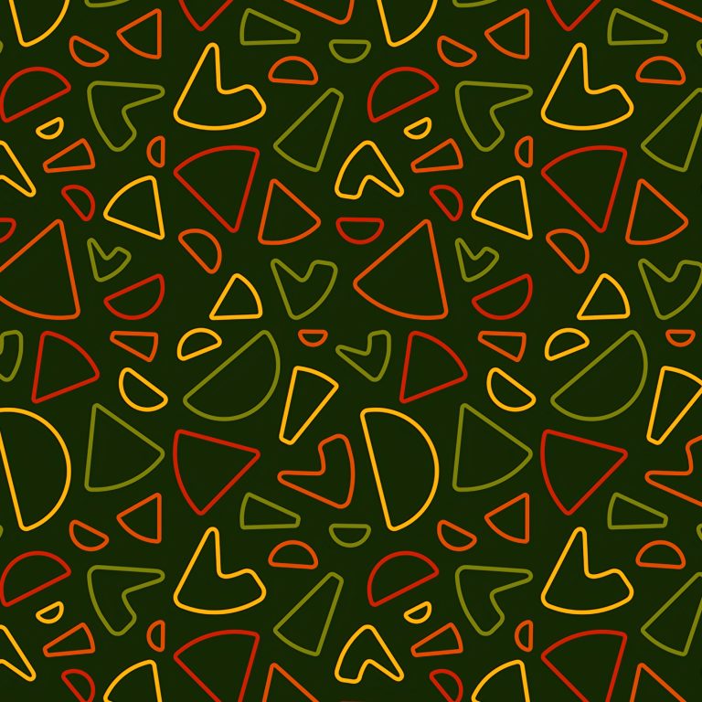
The Davilla Pizza Delivery logo is a brilliant exercise in abstract representation, designed to convey speed, quality, and the chaotic fun of food delivery through a minimalist, modern aesthetic. The primary mark is a dynamic arrangement of brightly colored, abstract shapes that cleverly form the word “DaVILA.” These shapes use a palette of pizza-topping colors—rich tomato red, olive green, and vibrant cheese yellow/orange—implying the freshness and flavor of the ingredients without being overtly literal. The abstract nature of the logo gives the brand a sophistication rarely seen in the delivery sector, positioning it as a modern, design-forward service.

93 Supreme

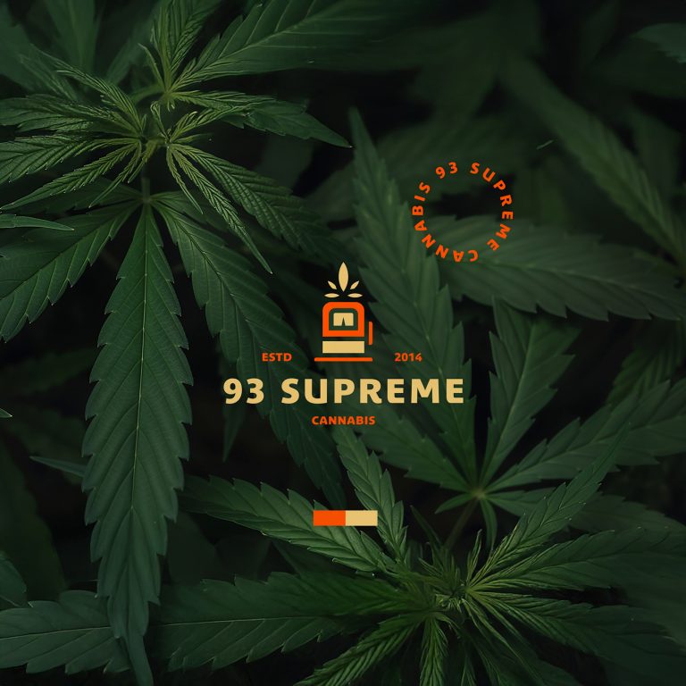
The 93 Supreme Cannabis logo is a strategic exercise in visual disruption, purposefully moving beyond the industry’s conventional aesthetic. The core mark is a distinctive fusion of two seemingly disparate concepts: the organic geometry of the cannabis leaf with the clean, structured lines of a gas pump or premium fuel dispenser. This unique iconography immediately communicates the brand’s core promise, establishing a powerful narrative that positions 93 Supreme as providing a reliable, high-octane product—the absolute best “fuel” for the body and mind. It is a modern symbol that anchors the brand in both nature and efficiency, signifying a product that is both natural in origin and supreme in delivery.

Da Villa Pizza

The Davilla Pizza Delivery logo is a brilliant exercise in abstract representation, designed to convey speed, quality, and the chaotic fun of food delivery through a minimalist, modern aesthetic. The primary mark is a dynamic arrangement of brightly colored, abstract shapes that cleverly form the word “DaVILA.” These shapes use a palette of pizza-topping colors—rich tomato red, olive green, and vibrant cheese yellow/orange—implying the freshness and flavor of the ingredients without being overtly literal. The abstract nature of the logo gives the brand a sophistication rarely seen in the delivery sector, positioning it as a modern, design-forward service.

View Project

93 Supreme

The 93 Supreme Cannabis logo is a strategic exercise in visual disruption, purposefully moving beyond the industry’s conventional aesthetic. The core mark is a distinctive fusion of two seemingly disparate concepts: the organic geometry of the cannabis leaf with the clean, structured lines of a gas pump or premium fuel dispenser. This unique iconography immediately communicates the brand’s core promise, establishing a powerful narrative that positions 93 Supreme as providing a reliable, high-octane product—the absolute best “fuel” for the body and mind. It is a modern symbol that anchors the brand in both nature and efficiency, signifying a product that is both natural in origin and supreme in delivery.

View Project