Combination Mark Mascot Logo Wordmark

Combination Mark

Fiera Films

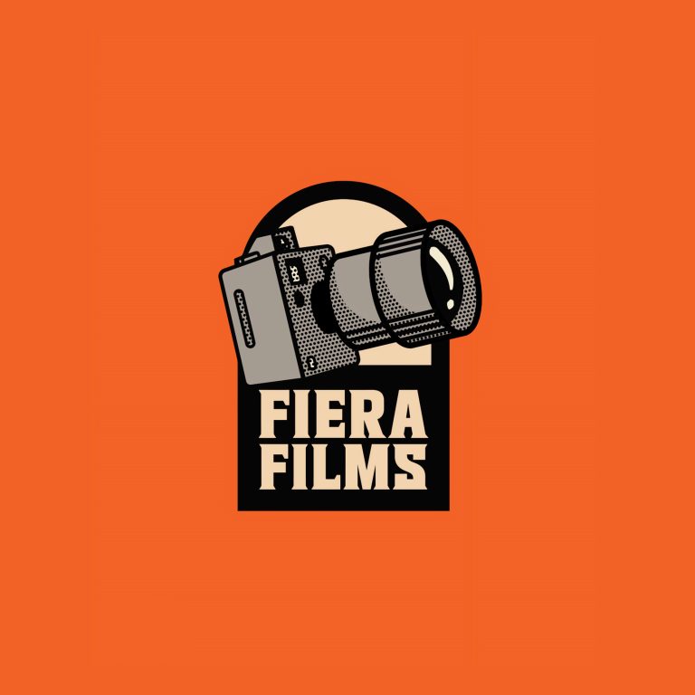
The Fiera Films brand identity is a striking and complex visual system developed for a film production company that deliberately embraces a fierce, untamed aesthetic to communicate its creative intensity. The identity utilizes a distinctive color palette built on a dynamic contrast: a warm, intense burnt orange/tangerine provides the brand’s primary energy, which is grounded by a serious black/charcoal and balanced by a crisp cream or off-white background. This combination evokes a vintage, high-quality, and slightly nostalgic aesthetic, similar to classic sports apparel or old-school movie graphics. The overall look successfully positions Fiera Films as a high-impact creative house that brings intense passion to every project, moving beyond the typical corporate seriousness of the film industry.

Crookie Bomb

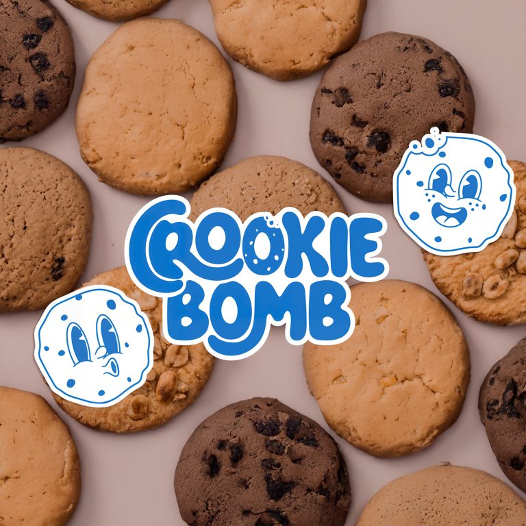
The Cookie Bomb brand identity is built on high-energy fun and approachability, designed to capture the attention of a playful, modern audience in the crowded dessert market. The core element is a charismatic mascot—a cookie that has come to life—rendered in a charming, vintage cartoon style using simple line work and a cheerful expression. This mascot often appears in an action pose, like running or floating, immediately signaling that this product is active, exciting, and full of flavor. The brand’s vibrant palette of electric blue, soft pink, and crisp white reinforces this joyful, almost juvenile energy, making the product feel irresistible and lighthearted.

Bully Corp

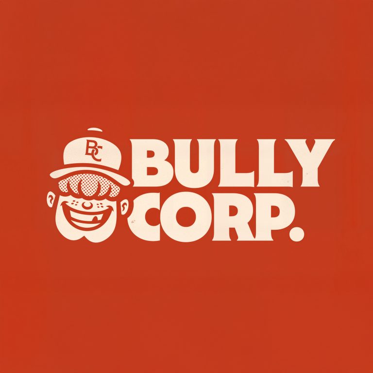
The Bully Corp. identity is built upon a bold, playful, and instantly recognizable mascot that embodies a blend of youthful mischief and aggressive competence. The primary emblem features a grinning character, possibly a “bully,” rendered in a thick-lined, vintage cartoon style, complete with a baseball cap that features a subtle BC monogram. This design strategically leverages a nostalgic aesthetic—reminiscent of mid-20th-century sports mascots or classic Americana—to create a brand that feels established, spirited, and ready to compete. The core palette of distressed reddish-brown (terra cotta/red clay) and off-white reinforces this retro, durable sensibility.

Fiera Films

The Fiera Films brand identity is a striking and complex visual system developed for a film production company that deliberately embraces a fierce, untamed aesthetic to communicate its creative intensity. The identity utilizes a distinctive color palette built on a dynamic contrast: a warm, intense burnt orange/tangerine provides the brand’s primary energy, which is grounded by a serious black/charcoal and balanced by a crisp cream or off-white background. This combination evokes a vintage, high-quality, and slightly nostalgic aesthetic, similar to classic sports apparel or old-school movie graphics. The overall look successfully positions Fiera Films as a high-impact creative house that brings intense passion to every project, moving beyond the typical corporate seriousness of the film industry.

View Project

Crookie Bomb

The Cookie Bomb brand identity is built on high-energy fun and approachability, designed to capture the attention of a playful, modern audience in the crowded dessert market. The core element is a charismatic mascot—a cookie that has come to life—rendered in a charming, vintage cartoon style using simple line work and a cheerful expression. This mascot often appears in an action pose, like running or floating, immediately signaling that this product is active, exciting, and full of flavor. The brand’s vibrant palette of electric blue, soft pink, and crisp white reinforces this joyful, almost juvenile energy, making the product feel irresistible and lighthearted.

View Project

Bully Corp

The Bully Corp. identity is built upon a bold, playful, and instantly recognizable mascot that embodies a blend of youthful mischief and aggressive competence. The primary emblem features a grinning character, possibly a “bully,” rendered in a thick-lined, vintage cartoon style, complete with a baseball cap that features a subtle BC monogram. This design strategically leverages a nostalgic aesthetic—reminiscent of mid-20th-century sports mascots or classic Americana—to create a brand that feels established, spirited, and ready to compete. The core palette of distressed reddish-brown (terra cotta/red clay) and off-white reinforces this retro, durable sensibility.

View Project